When it comes to designing intuitive UI’s, many designers will agree that a design that silently talks to the user is the best kind of design… and adding motion to your designs is probably the best way to make that happen!
Motion (animations) makes your UI’s expressive and understandable, making your designs come to life. Moreover, users love them as well as it makes the whole experience feel like it’s handcrafted just for them and makes navigation a piece of cake.
And today, you’ll be able to see motion design elements in almost every app you use. It has become more of a required skill for UI designers rather than a fancy course that they can take up when needed.
Animations are present on almost every step you take inside an app or on a website. The buffer circle that shows up when playing a video in youtube… yes, it’s also a type of animation. On Facebook, deleted messages going down in the dust and other messages re-aligning themselves automatically to make up for their lost comrade automatically is also an animation. Or it can be something as simple as a button lighting up when clicked.
They are there to deliver a streamlined user experience.
And probably, the best places to add animations or visual effects in your design is when the user interacts with an element, when the user is waiting for something or when a transition happens.
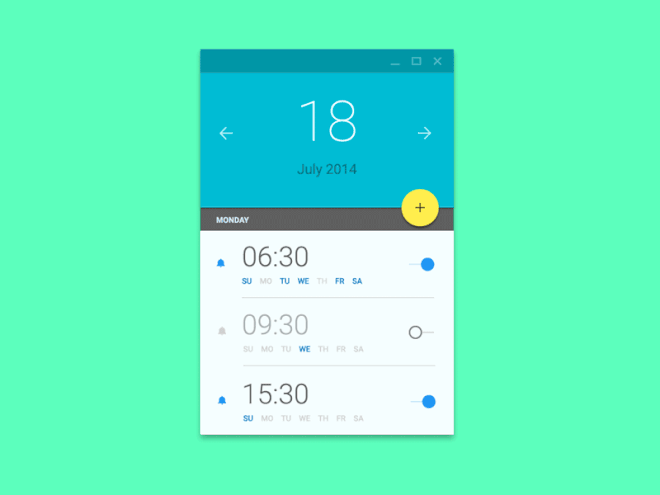
Let’s take an example of a simple UI motion design and an optimized version of it to see how adding simple animations can streamline the entire user experience. Have a look –
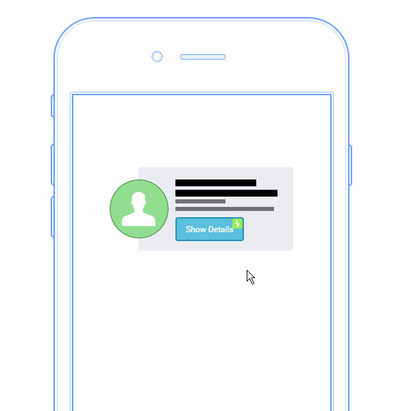
https://medium.com/@sophie_paxtonUX/stop-gratuitous-ui-animation-9ece9aa9eb97
Here’s the optimized version of it –
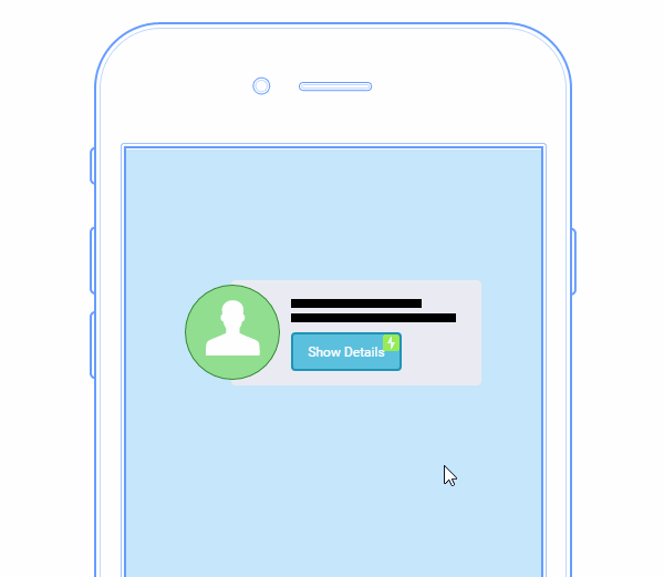
Credit:https://medium.com/@sophie_paxtonUX/stop-gratuitous-ui-animation-9ece9aa9eb97
The differences cannot be ignored. In the optimized design, the transition is smoother and eats up less time of the user, which is always a good thing. And this is just about adding animations for a single function, imagine how impactful it can be for your whole app if done correctly for all the functions and transitions.
Apart from reducing a lot of waiting time for the user, here are some other ways adding motion design to your app or website may help users –
1. Visual Cues
Flat designs make hard for users to figure out what to do next. But with motion design and simple animations, you can easily guide a user through your app or website to keep the frustration levels at a minimum.
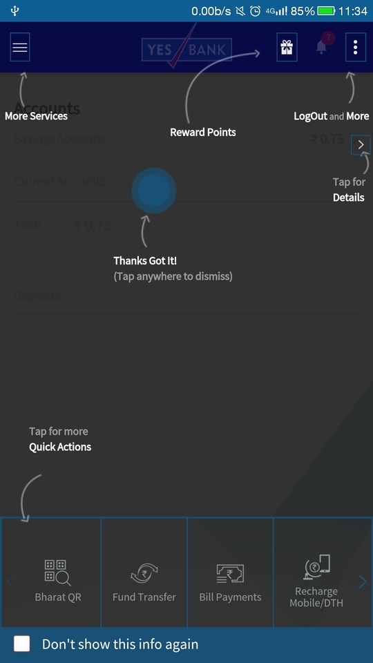
YES Bank’s way of onboarding users using animations
And animations like these are being widely used to make user onboarding a breeze worldwide.
Motion can be easily used to convey to the user what to do next, what’s the most important part of a page and where to focus. It brings life to your design and can be used to convey whatever you want.
Like the example above, motion can be easily used to give instant feedback of any action taken by the user.
2. Seamless transitions
Making transitions smoother and more fluid is the essence of motion design.
It helps users understand the flow of things in your app and can marginally enhance the user experience by making navigation more user-friendly and understandable.
The example we used at the beginning of this blog is a perfect example of how you can optimize the end user experience of your app or website by streamlining transitions with motion design.
3. Adds personality
Adding motion design can reinforce your brand’s unique identity within your digital product.
When one thinks about a person’s personality, one tends to notice their body language and the way they move to get a better idea. The same is the case for how one perceives the motion in an app or website interface to evaluate a brand’s true character.
Implementing motion design in your mobile app or website ensures that digital interactions stay true to your brand and resonates with your users at the same time.
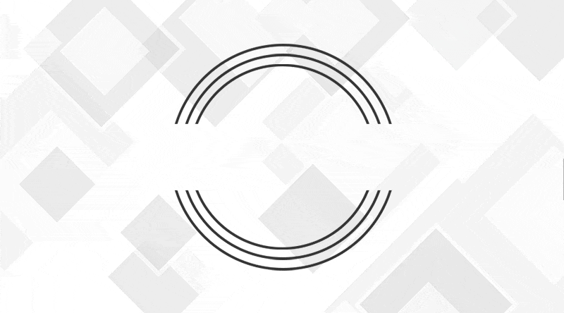
As an example, I recently came across a beautiful animation on the Screaming Frog’s website that made me like them a bit more –
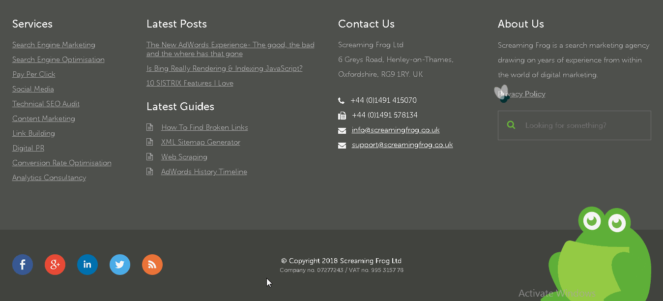
If you are unaware of what Screaming Frog is, at first glance, it may seem like they did this animation for the lols. But the motion really comes into perspective when you align it with what they do.
Screaming Frog is a complete SEO tool that helps webmasters run SEO audits on their website, highlighting every single problem there is with their website’s structure that isn’t resonating well with Google and other search engines.
Got the context? The interactive animation very easily doubles down on what they do! Which is getting rid of bugs (broken links, duplicate content & other SEO problems) on a website that is hurting it’s ranking on search engines.
It’s a perfect example of using the kind of animation that aligns perfectly with a brand, resonates with target users and engages them at the same time.
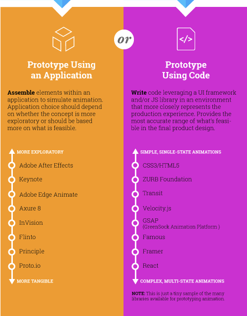
To get started with motion designing, you can use an application that has pre-built elements to simulate animation or you can write it’s code from scratch (you’ll need the help of able developers if you decide to go down this route)
Here are some tools that can help you with both –
In this highly competitive online world, a brand that provides the best browsing experience to their users will always stand out from the crowd.
And motion design is probably the best way to do that. But tread cautiously… if done improperly, they can distract, overwhelm or even repel a user.
The magic happens when animations are used sparingly but are impactful (like Screaming Frog). When used properly, motion design and graphics can woo users with engaging, interesting and subtle actions that convince them to stick with your brand and builds a strong relationship over time.
How have you implemented motion design on your website or mobile app? Let us know in the comments.